This post will tell you more about the new features touch typing trainer component of the upcoming version of KTouch, but before I come to that, I will write a little bit about the approach I took to design the new user interface.
Design Principles
Actually this boils down to two simple points:
Act like a game
Learning touch typing is boring enough, the application one uses to achieve this goal should make the experience as much funny as possible while not getting in the way. A good way to do so is to borrow some of principles from video games which render them as engaging and addicting as they are.
Keep it simple
Learning touch typing should be possible for every literate person. After all, KTouch is an educational application targeted at especially at pupils. So knowledge about technical details like the existence of keyboard layouts can't be assumed. The user interface hast to be designed accordingly.
The New Features
The new user interface is split into several screens, each responsible for a certain feature set. This keeps the complexity low, because it reduces the amount of controls visible at any given time and guides the user on their way through the application.
1. The Welcome Screen
{% img /images/screenshots/ktouch/welcome20120914.png%}
This is very first thing a new user of KTouch will see and it is the only setup necessary to start training. It should be pretty much self-explanatory.
2. The Home Screen
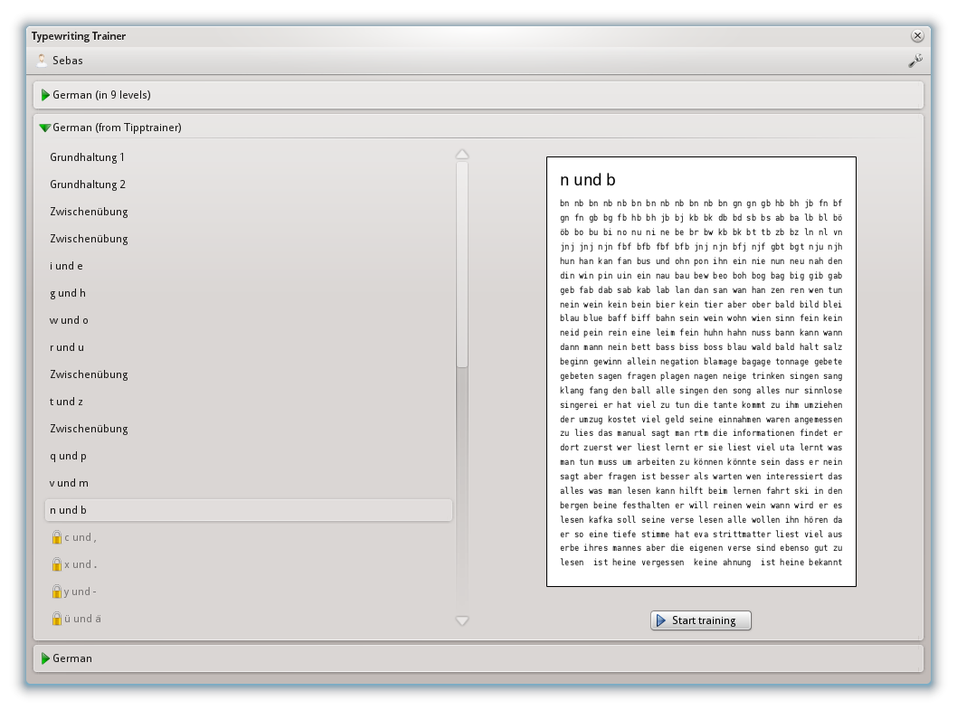
From here the user picks a lesson to train on out of the courses matching their current system keyboard layout. It also provides access to profile managment, the keyboard layout and course editor and the configuration dialogs.
3. The Trainer
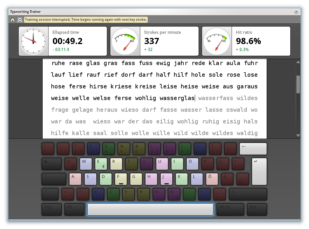
That's the part of the application a typical user will spend the most time on. Therefore extra effort went into this screen to make its operation as smooth as possible. Every dynamic part of the user interface is animated in a nice and unobtrusive way. Small features, like stopping the time when the window looses its focus, help to improve the overall training experience. Users wanting an absolute minimum of distraction while training may choose to hide the keyboard and now also the real-time statistics readings in the application settings.
There is more
Careful readers will have noticed, that I mentioned an editor component — this one deserves a post on its own.
After completing a lesson, the user won't return immediately to the home screen. Instead a special summary and statistics screen is shown. Right now it is still largely unfinished, so no screenshot right now.
The good news is that the KDE e.V. gave me the opportunity to attend to the upcoming Randa 2012 sprint. Looking at my todo list, this summary screen will be among my top priority tasks I want to work on in Randa.
Organizing a sprint of this scale costs a lot of money. So if you able to donate some money, please do so. For me as a volunteer developer such an event is an exceptional opportunity, your donation makes it possible. Thank you!